It’s likely that you’ve seen Thomas Fletcher’s work, but it’s also likely that you’ve never thought twice about it. Twenty or so years ago, the designer’s job required him to shove his screaming face through a sheet of latex, create 3D models of Chitty Chitty Bang Bang, motion-capture a dancer seductively sauntering across a room and play around with props from the Harry Potter films. But none of this creative and “very, very fun” work ever appeared during the two-hour runtime of a single blockbuster – instead, you saw it when you stuck a disc into your DVD player, before you pressed play.
At the dawn of the DVD, menus were essential, as they listed – sometimes in very inventive ways – all the extras that were intended to enhance your viewing pleasure. “We had to convince people what made a DVD so special,” says Fletcher, who worked on some of the very first to be released in the US. The new format offered interactivity: games, gags, alternative scenes and hidden extras known as “Easter eggs” that persuaded people to drop £20 on their first ever Digital Versatile Disc. And because menu design was so new in the late 90s and early 00s, artists such as Fletcher had an impressive amount of creative freedom. “It was an open wild, wild west,” he says. “We could do what we wanted.”
For many people, DVD menus were just something that looped in the background of teenage make-out sessions, and DVDs themselves are an artefact of the past. In 2018 alone, there was a £250m drop in media disc sales in the UK, and by 2021, almost half of Brits were subscribed to two or more streaming services. At just 25 years old, DVDs are antiquated – but that also makes them ripe for reminiscing. In the summer of 2022, 3.3 million people watched a TikTok video about the elaborate interactive menu on Harry Potter and the Philosopher’s Stone. The hashtag #DVDmenu has 15m views.
Is this just pointless nostalgia or is it right to mourn the lost art of the DVD menu? Some turn-of-the-century landing pages were so imaginative they cut through into popular consciousness: 2003’s House of 1,000 Corpses featured a murderous clown directly addressing (and mocking) the viewer, while the aforementioned Harry Potter DVD let viewers choose a wand, cast spells and solve puzzles to access deleted scenes. What was it like to work in the golden age of DVD menu design? What has been lost now that we scroll on streaming apps?
If you ever stuck a Jeepers Creepers 2 disc into a DVD player then you have seen Fletcher’s face: for the 2003 release, the motion designer pushed his head through a sheet of a latex and mapped the results on to the wing of the demonic Creeper to make an eerie menu backdrop. In the 90s, Fletcher was creating packaging for VHS tapes, but after he got a job at LA-based design company DZN, he worked on the DVD menus for big releases.
“The really creative menus added so much to the experience,” Fletcher says. For the 2002 Bond film Die Another Day, he filmed a dancer in a motion capture suit: she became a shadowy nude who strolled across the screen. For Harry Potter and the Prisoner of Azkaban, he had access to the real Marauder’s Map used in the film, and created an elaborate fold-out menu with animated footsteps. “A lot of times, the directors would be involved,” Fletcher says. For example, when he worked on Big Fish, Tim Burton gave Fletcher notes on his menu design. “That was so rewarding.”
Amy Voorhees Searles has it “on good authority” that she made Taika Waititi cry. As a disc menu and interactive content producer in the 00s, she worked on the film-maker’s directorial debut Eagle vs Shark, and scored the menu with melancholy music. But not everyone was so enamoured of her craft. “When I would explain to people what I did for a living,” she says, “I would either be met with blank stares, or I would be asked if I could ‘make them quieter.’”
Still, Voorhees Searles has won awards for her menus on the Alien: Covenant, Stoker, and American Horror Story Blu-ray Discs. This new format was launched in 2006, and its advanced functionalities meant “everyone was keen to push the boundaries in fun and occasionally bizarre ways”. For example, for 2010’s Alice in Wonderland, Voorhees Searles created a suite of illustrated icons that reflected a viewer’s time of day and local weather conditions. Unfortunately, it would only work if their Blu-ray player was connected to the internet.
In the beginning, DVDs were more technologically limited. At the turn of the millennium, Danielle Corey led a team of 30 who developed games and special features at DZN. “The technology was so simple,” Corey says. “If we were doing games, really all you could do was choose a location on the screen in XY coordinates, that you could press to make an action happen.” Corey had to get creative. She allowed viewers to wander through Hogwarts castle on 2004’s Harry Potter and the Prisoner of Azkaban disc, “but in reality, it was just a bunch of video clips.” She designed a game for a 2003 release of Chitty Chitty Bang Bang that allowed the viewer to fly the car and drop sweets into the arms of excited kids.
Designers also had to consider the limitations of the televisions that DVD players were connected to. Back then, screens were curved at the edges, so nothing could be placed in the menu’s corners in case it got lost. There were also colour limitations: bright red would bleed and bright white would jitter. But “constraints lead to creativity,” says Corey. She would ask herself: “How can I trick this dumb technology to do something interesting?”
For a brief, heady period, Easter eggs were the answer. By clicking around the screen, viewers could find hidden icons that would take them to bonus content. For example, if you went to scene 27 on 2001’s The Lord of the Rings: The Fellowship of the Ring and pressed down, you’d be taken to a parody video featuring Jack Black and Sarah Michelle Gellar.
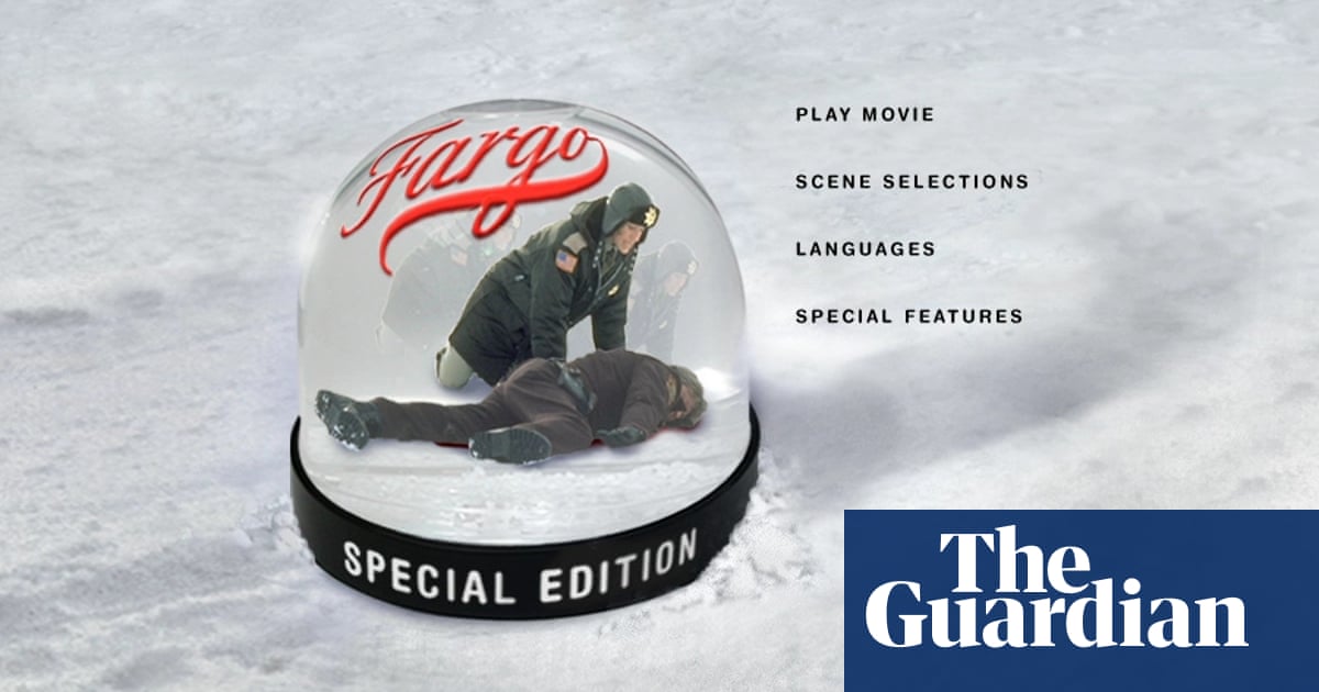
Fletcher’s favourite Easter egg was on the 2003 Fargo DVD. He had mocked up a woodchipper with a guy’s leg sticking out in homage to one of the movie’s most famous scenes, but “the studio were worried it might be a little bit too much for general audiences”. So instead, he turned the image into an alternative menu that viewers could find if they clicked a hidden snowglobe.
Easter eggs often took viewers to special features. Director David Prior, best known for his 2020 horror The Empty Man, spent the 00s producing bonus features for films such as The Curious Case of Benjamin Button and The Girl with the Dragon Tattoo. “I’d just watch the movie a few times and use the special features to find the answers to whatever questions I found most intriguing,” Prior says. Sometimes, this involved making an entire other movie. Prior’s behind-the-scenes documentary on The Social Network DVD, How Did They Ever Make a Movie of Facebook? is an hour and a half long.
Former Warner Bros marketer Richard Burniston also enjoyed making special features. For 2002’s Bend It Like Beckham, he filmed director Gurinder Chadha cooking aloo gobi with her mum and auntie. This 14-minute featurette was inspired by a single line in the film. “We took the creative freedom with both hands,” Burniston says. He won an award for the menu for Kevin & Perry Go Large, for which he filmed comedian Harry Enfield in character as Kevin for a short intro. “There’s one point where he gets an absolutely giant erection,” Burniston gleefully recalls.
Fake erections are perhaps not the height of menu design, but they demonstrate the freedom once given to creatives. Viewers who bought the 10th-anniversary edition of Fight Club in 2009 got a shock upon inserting the disc when a fake menu for the romcom Never Been Kissed loaded instead. “Fox needed to seek Drew Barrymore’s approval in order to pull off that gag,” recalls Voorhees Searles, “and clearly she was comfortable and self-aware enough to see the humour in it.”
Voorhees Searles says that, as DVDs began to decline in popularity, studios began creating templates for their menus, forcing designers to take fewer risks. Many of those who worked in menu design mourn the loss. “I consider the DVD menu the same as old LPs where you used to get liner notes, inserts, multi-page album covers – all that is lost,” says Fletcher.
“A lot of passionate, talented people have worked far harder than a rational mind could possibly conceive of in this remote, unlit corner of the entertainment industry,” says Voorhees Searles, who did her first ever 48-hour shift while working on 2009’s Avatar. “We poured a lot of care and emotion into something that was invisible to most and a nuisance to others.”
Voorhees Searles thinks it can be “liberating” to be “confronted with the insignificance of your life’s work”, but on social media there’s a growing – if late – appreciation of the art of menu design. “Miss when they put effort into DVDs,” reads one comment with 38,000 likes on the viral Harry Potter TikTok.
“It was just a truly golden age,” Fletcher recalls. “Our imagination was the limit.”


